Our Colour Philosophy
At Truliv, our colour palette reflects the essence of modern co-living—warm, welcoming, and thoughtfully curated. Our colours are designed to evoke comfort, connection, and inspiration, seamlessly blending into both digital and physical brand expressions.
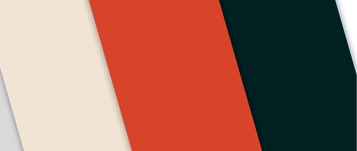
Primary palette
Our primary colours define Truliv’s core brand identity. These colours should be used consistently across all brand touchpoints, from digital platforms to physical spaces.
CG Red
#DB4429
RGB (216, 68, 41)
CMYK (0%, 69%, 81%, 15%)
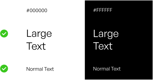
Black
#000000
RGB (0, 0, 0)
CMYK (0%, 0%, 0%, 100%)
Light Silver
#D9D9D9
RGB (217, 217, 217)
CMYK (0%, 0%, 0%, 15%)
White
#FFFFFF
RGB (255, 255, 255)
CMYK (0%, 0%, 0%, 10%)
Usage: Primary colours should dominate brand applications, forming the foundation of Truliv’s identity.
Secondary palette
The secondary colours complement our primary palette, adding flexibility while maintaining consistency. They should be used sparingly for accents, highlights, and to create visual hierarchy.
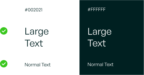
Dark Green
#002021
RGB (0, 32, 33)
CMYK (100%, 3%, 0%, 87%)
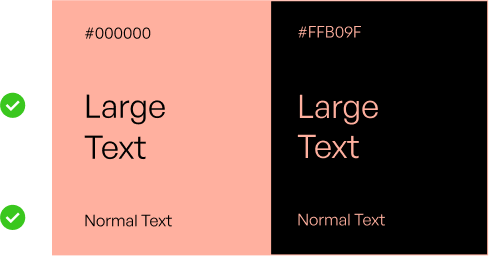
Light Salmon Pink
#FFB09F
RGB (255, 176, 159)
CMYK (0%, 31%, 38%, 0%)
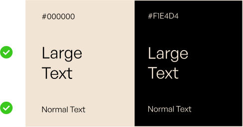
White Chocolate
#F1E4D4
RGB (241, 228, 212)
CMYK (0%, 5%, 12%, 6%)
These colours should be used strategically in digital graphics, print materials, and spatial design to enhance visual appeal without overpowering primary colours.
Extended Colour System
In addition to our Primary and Secondary palettes, we have an Extended Colour System that provides further depth and flexibility to Truliv’s branding. These colours help define different moods, maintain visual consistency, and enhance adaptability across various brand applications.
Brand Colours
Our core brand colours establish the visual identity of Truliv, ensuring a consistent and recognizable presence. These colours should be used as the foundation across all brand materials.
Usage: Brand colours should be used strategically to maintain consistency across marketing, UI, and physical spaces.
Natural Colours
Our neutral colours offer a refined backdrop that complements both primary and secondary palettes. They add depth, balance, and sophistication to our designs.
Usage: Neutral colours should be used as backgrounds, text colours, or supporting elements to create contrast and legibility.
Sector-Specific Colours
To differentiate various Truliv sectors while maintaining brand harmony, we incorporate a sector-based colour approach.
Usage: Sector colours should be used sparingly to highlight specific services, campaigns, or categories while maintaining overall brand consistency.
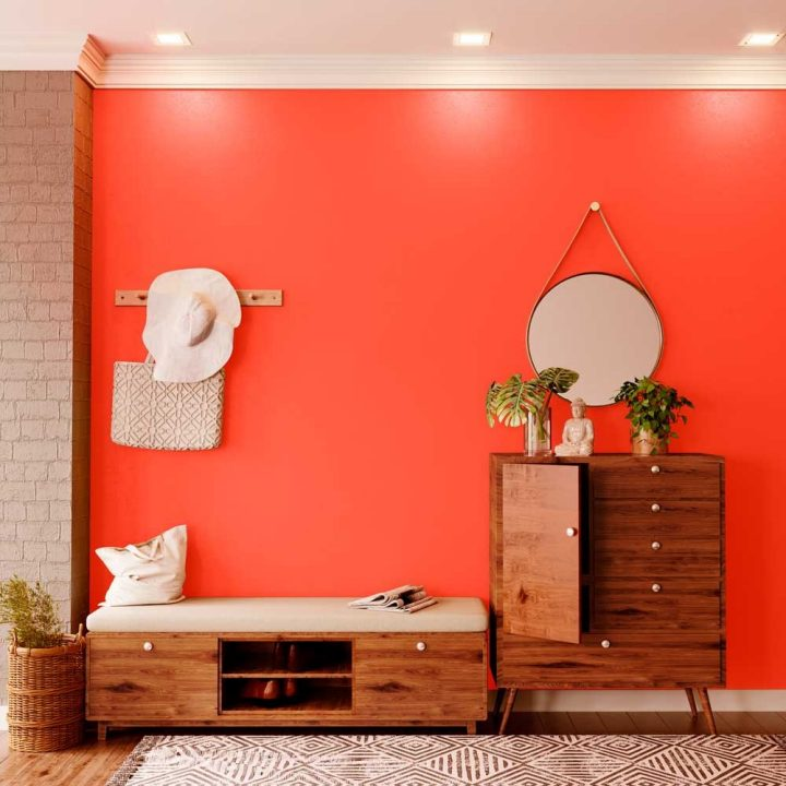
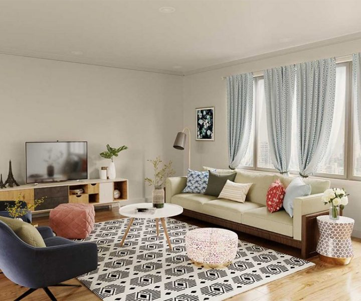
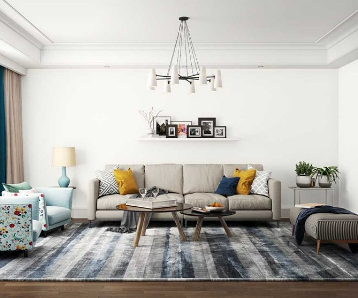
Truliv Interior Colours
Truliv’s interior colour palette brings brand warmth to every space. With precise Asian Paints codes for soft neutrals and vibrant accents, it ensures cohesive, inviting environments that reflect Truliv’s identity.
Autumn Day – 8203
#F0D7CB
Meadowlark – 9194
#F4E5AB
Absolute White – L161
#F4F0EF
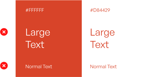
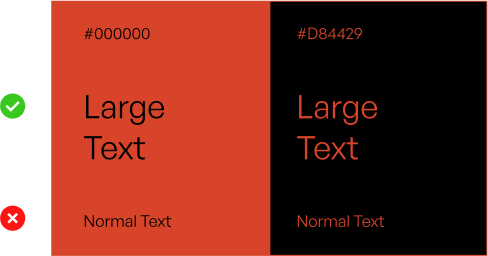
Web Accessibility
The Web content Accessibility Guidelines (WCAG) are standards that help make the internet accessible to everyone, including people with disabilities. With colour, they tell us the amount of visual contrast required between a piece of text and the background to maintain legibility for users with visual impairments.
When picking colours for web, we aim to comply with WcAG 2.0 standards for both large and normal text sizes. Large text is 14pt (18.66px) when set in a bold weight, or 18pt (24px) when set in a lighter weight. Any text beneath these sizes is considered normal text.
We always want to achieve a AAA rating, which is the highest possible compliance level (noted in green).
Fully Complient
Partially compliant
The first combination does not meet AAA compliant at normal text sizes while the second combination fails to meet AAA compliant at any text size.