Visual Identity
Typesetting
Typesetting is the craft of arranging text in a visually appealing and legible manner. It's a fundamental aspect of our brand guidelines that ensures consistency and professionalism across all our communications.
This section provides essential guidance on how to effectively use our typefaces, including General Sans, to create harmonious layouts that support our brand's identity and enhance the reader's experience.
On this page
Hierarchy, Scale & Tracking
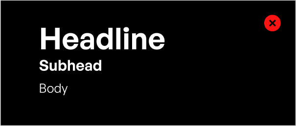
Extra Large Headline
Extra large headlines are reserved for high-impact applications where maximum visibility is required. These are typically found on presentation covers, section dividers in slide decks, and various forms of physical signage. Extra Large Headline is set in TF-Gaelic-Truliv

Headline
TF-Gaelic-Truliv is used for all external-facing headlines, set in title case for everyday documents or sentence case for comms.

Subhead
General Sans Semibold is used for all standard subheads, set in title case for everyday documents or sentence case for comms.

Inline Header
General Sans Semibold is used for all standard inline headers, set in title case for everyday documents or sentence case for comms.

Body Copy
Use General Sans Regular for body text, captions, and other detailed info.

Padding
As our type sizes shift between applications, the vertical padding should scale.
The minimum space following any headline should be 75% of the headline’s cap height. The minimum space following a subhead or body paragraph is equal to 100% of the subhead or body copy’s cap height.
Note
This is a good rule of thumb for most applications. In layouts with limited space, padding between type can be condensed.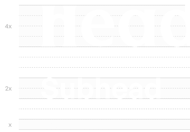
Leading
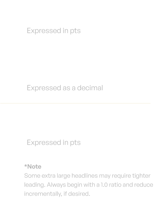
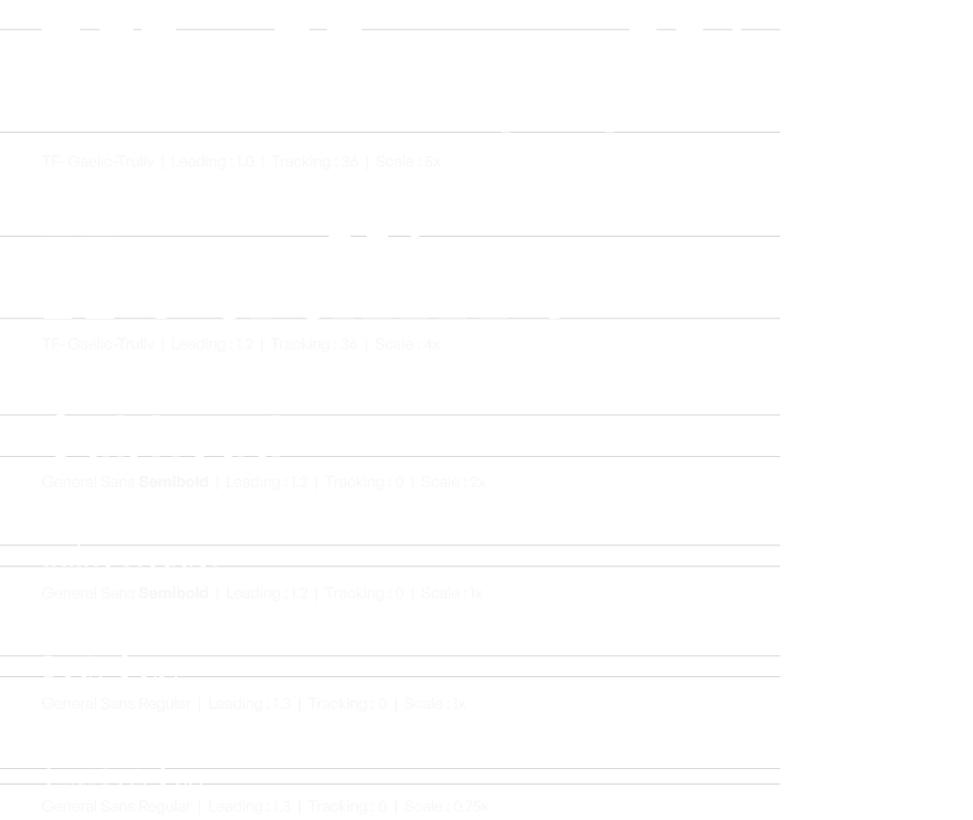
Calculate leading values using the formula: Leading = Type Size x Leading Ratio. Refer to the provided table for predetermined ratios by type level. For instance, a subhead at 100pts uses a leading of 120pts (100 x 1.2).
Type Level
Leading Ratio
Extra Large Headlines
1.0*
Headline
1.2
Subheads
1.2
Inline Headings
1.2
Body Copy
1.2
Small Body Copy
1.3
Capitalization
General Rule
Across all brand communications, maintain a consistent approach to capitalization to ensure clarity and brand voice.

Use sentence case capitalization when speaking externally to customers.
External Communications:
Use sentence case for headlines and subheads to keep content casual and consistent. Include punctuation as needed for tone and grammar.

Use title case capitalization for routine internal documents.
Internal Documents:
Apply title case for PowerPoint presentations, Word documents, and other internal materials for titles, headers, and section names.

Don't use all-caps headlines for any document type or audience.
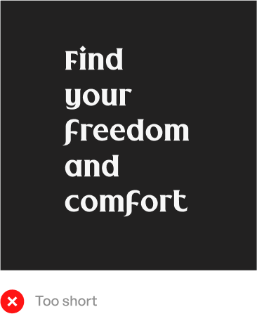
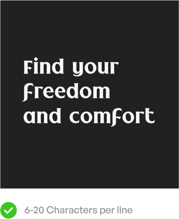
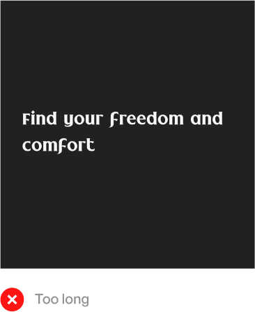
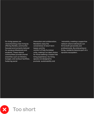
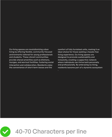
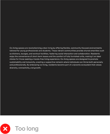
Line Length
Optimal Legibility:
To ensure readability, manage line length effectively. Headlines should contain 6 to 18 characters per line, while paragraphs should fall within a 40 to 70 character range.
Text Division
For body paragraphs exceeding the recommended line length, consider dividing the text into columns. Include spaces and punctuation as part of the character count.
Note
Exceptions can be made in case the heading is less than 30 characters, or if there is a formation of a widow*.
Type Colour
Single colour application
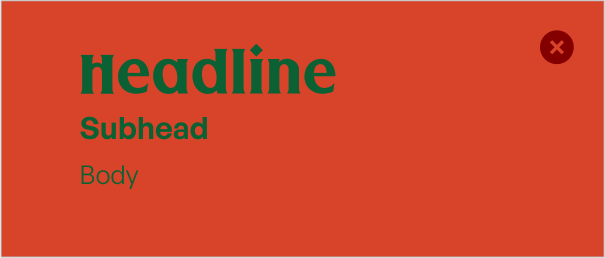
When applying colour to type, keep it simple and functional.Our standard approach is to limit yourself to a single type colour .Always choose your type colour to maximize contrast and legibility.
Here are some approved type and background combinations:
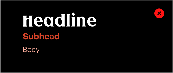
Double colour application
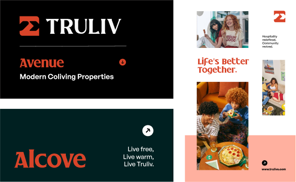
CG Red is designated exclusively for headlines in high-impact scenarios with minimal content. This ensures colour and typography are the primary drivers of brand recognition.
It is suitable for applications such as end cards, video supers, large-scale signage, and environmental graphics.
CG Red should not be utilized in contexts involving small, dense, or detailed text to avoid compromising legibility and brand consistency. Some sample use cases are shown here
Typesetting Quick Reference
Here’s an overview of our typesetting rules for typeface, weight, leading, tracking, and scale that were discussed above.
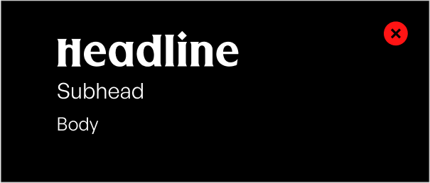
Type Don'ts
In our pursuit of brand consistency and visual integrity, it's crucial to understand what not to do with typography. This "Type Don'ts" section serves as a critical companion to our typographic guidelines. It highlights common pitfalls to avoid and provides clear directives to ensure that our brand's typographic elements are always used effectively and appropriately.
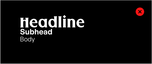
Don’t set headlines in all lowercase or oversized sizes.
Don’t set subheads in unexpected weights.
Don’t set levels of type too close together.
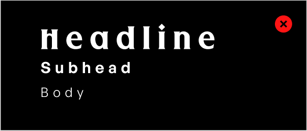
Don’t track out any typography.
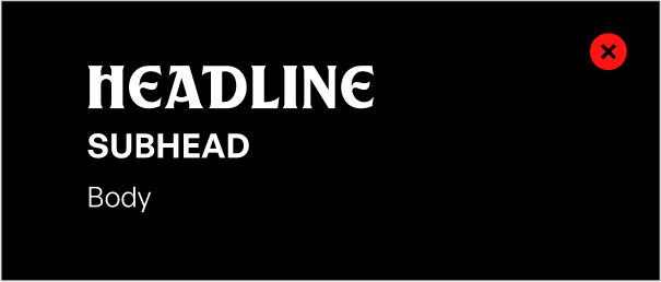
Don’t use all-caps for headlines or subheads.

Don’t set text levels of type too close in size.
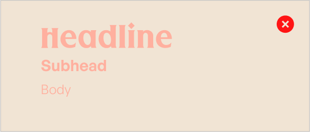
Don’t set text on color values with poor contrast.
Don’t use combinations that cause visual disturbance.
Don’t use too many typefaces or beyond.

