Visual Identity
Our Pattern
Patterns in our brand are more than decorative—they are extensions of our core identity. They echo our ethos, amplify recognition, and create a sense of visual continuity across touchpoints. Each pattern is designed to reflect our values, energy, and the layered experiences we promise to deliver.
On this page
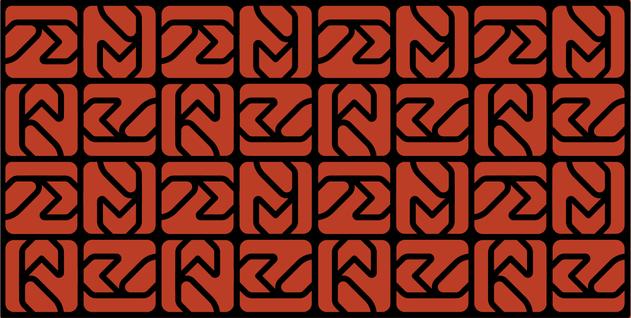
The Truliv Pattern
We took inspiration from the repetitive & rectangular theme of Greek pattern & executed the Truliv logomark in the similar manner. Since the brand takes inspiration from Greek mythologies this was a good way to communicate it.

Usage Guidelines
Contextual Harmony
Use patterns as background elements, accents, or transitions. They should never compete with key content like headlines or illustrations.

Scale & Contrast
Patterns can be scaled depending on the medium—but clarity and legibility must be maintained. Avoid overly dense applications that may appear cluttered.
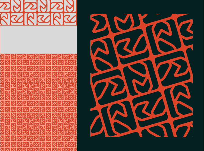
Color Variations
Stick to the brand palette when recoloring patterns. Use high-contrast combinations for dynamic expression, or tone-on-tone variations for subtlety.

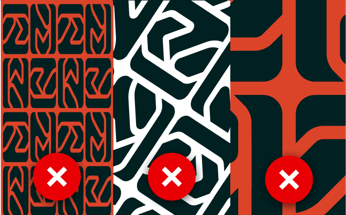
Do Not Distort
Maintain the integrity of the pattern’s geometry. Avoid stretching, skewing, or excessive cropping that may distort its essence.