Visual Identity
Our Illustration
Illustrations are a key part of Truliv’s visual identity—bringing warmth, personality, and human connection into our communication. They help soften our real estate narrative, adding approachability to our digital and physical spaces. These guidelines ensure consistent illustration use across touchpoints, whether on a website, poster, or over real imagery

On this page
Style & Structure
Our illustrations are line-focused, character-led, and grounded in minimalism. Each composition is created with intent and simplicity, avoiding visual clutter while retaining emotion.
Monoline Style
Maintain a consistent stroke weight throughout the artwork. Avoid mixing thick and thin lines—clarity comes from uniformity.
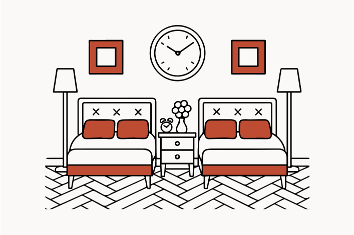
Limited Detailing
Facial expressions, clothing folds, and accessories are kept minimal. The goal is legibility, not complexity.

Stylized Proportions
Characters are drawn with slightly exaggerated lower bodies for a distinctive and balanced visual language. Keep this imbalance intact for consistency.

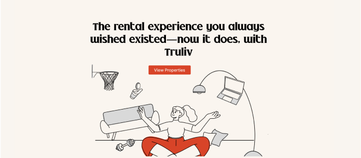
Color & Fill Use
Color is used strategically to emphasize brand tone without overwhelming the composition.
Use Fills Sparingly
Use fills sparingly—they should support, not dominate, the illustration.

Overlapping Illustrations
When overlapping illustrations with varied background tones, switch to alternate brand colors to ensure readability and contrast.

Web Layouts or CTAs
On web layouts or near CTAs, use subdued brand tones to maintain a clear visual hierarchy.
Illustrations on Real Images
When placing illustrations on top of photography:
Contextual Placement
Ensure the illustrated figures relate contextually to the environment (e.g., sitting on a bed, interacting with a door, engaging with furniture).
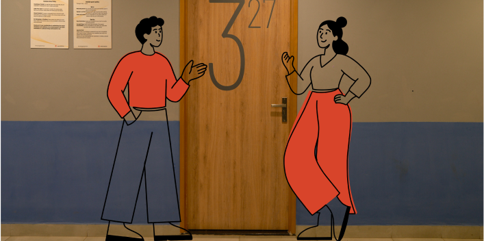
Contrast & Placement
Maintain adequate contrast between illustration and image through color and placement.

Consistent Lighting
Use consistent lighting logic and scale to blend them naturally into the spaces.
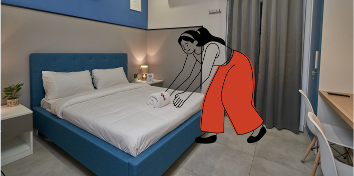
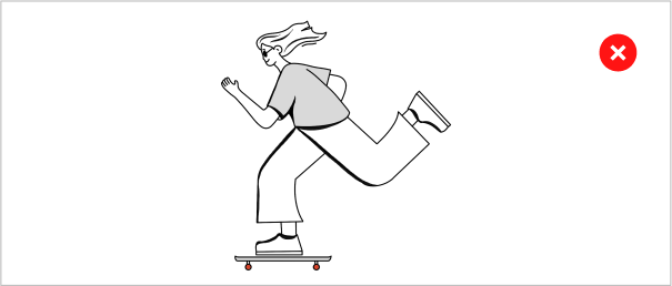
Illustration Don’ts
This section outlines common mistakes to avoid when working with illustrations. Following these guidelines ensures that every illustration aligns with our design principles and contributes to a cohesive, polished brand experience.

Do not apply gradient to the fill

Do not use varied stroke size

Do not use an illustration without a fill
Never use fill alone, outline the area with a contrasting stroke

Do not reduce the fill opacity

