Visual Identity
Our Icons
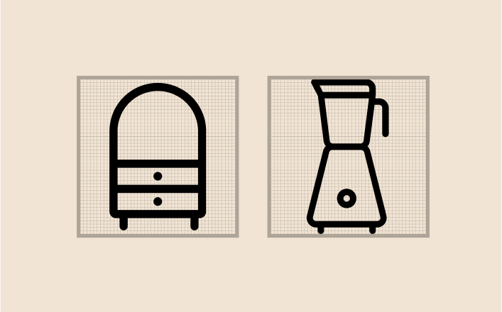
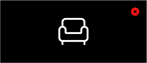
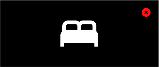
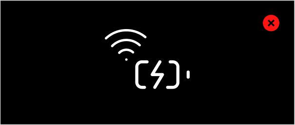
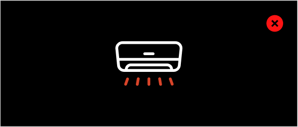
Our icon system is designed to be clean, minimal, and intuitive— enhancing clarity without overwhelming the user. Each icon is crafted with consistent line weight, rounded corners, and a balanced structure to maintain visual harmony across all brand touchpoints.

Design Principles
Our icons follow a structured approach to ensure clarity and visual harmony

Geometric Consistency
Built on a grid system for balance and uniformity.

Minimal & Clear
Stripped of unnecessary detail for quick recognition.
Construction & Grid System
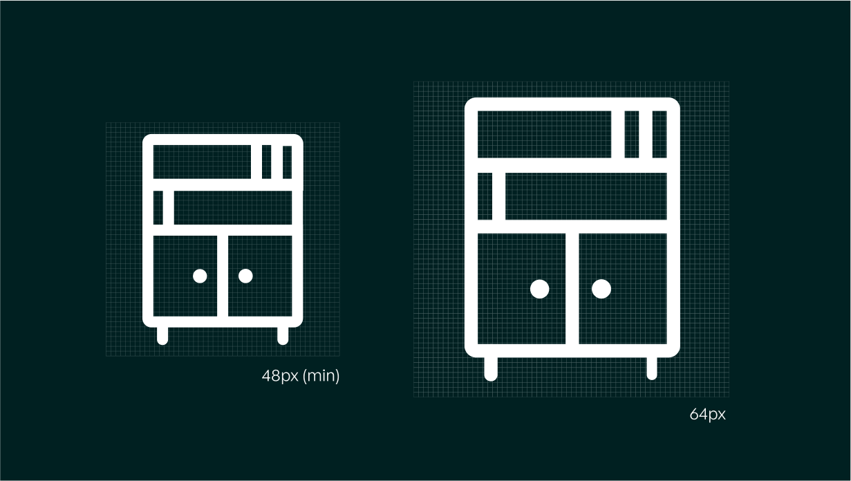
Our icons are crafted on a 48px grid, ensuring proportionate scaling across different interfaces. Key construction guidelines include:
Stroke Weight
A uniform stroke thickness maintains consistency. We maintain a stroke weight of 2px for icons sized at 48px, which constitute the bulk of our icon library. Exceptions to this standard are the 64px and 96px icons, which feature stroke weights of 2.5px and 3px.
Corner Radius
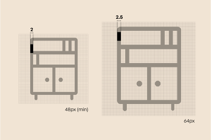
Corner radius is proportional to icon size and assumes a center-aligned stroke. For reference:
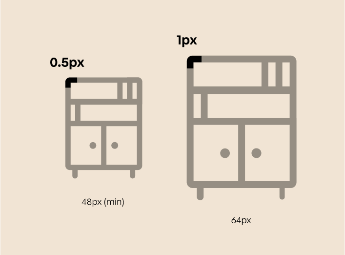
- 48px icons use a 0.5px radius
- 64px icons use a 1px radius
- 96px icons use a 1.5px radius
Please note that using an inside- or outside-aligned stroke line will result in an incorrect corner radius. When using these alternative alignments, the corner radius must be adjusted to match the centered stroke specifications.
Safe Space
Each icon is centered within its grid, with balanced negative space for clarity.
The safe space around our icons is consistently maintained at a minimum of 1px for all sizes. However, circles and various shapes are sometimes allowed to enter this space to aid in optical alignment.
Icons Don’ts
This section outlines common mistakes to avoid when working with icons. Following these guidelines ensures that every icon aligns with our design principles and contributes to a cohesive, polished brand experience. Avoiding these pitfalls helps preserve the simplicity, scalability, and personality that define our icon system.
Don’t modify or change our icons
Don’t create icons that have a visually different style
Don’t use multiple icons to create a new icon or larger graphic
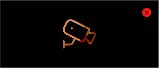
Don’t segment an icon into multiple colors
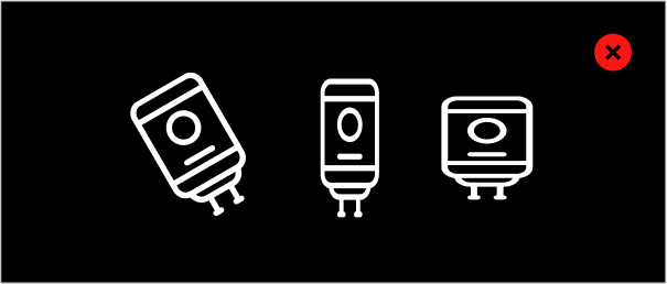
Don’t rotate, skew, or stretch icons
Don’t alter the stroke weight of an icon

Don’t apply gradients or other effects to icons
Don’t fill icons with patterns or imagery
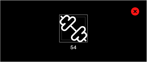
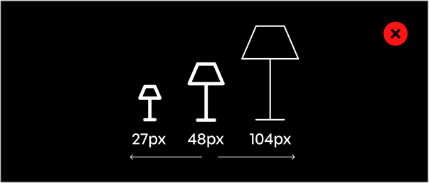
Don’t create arbitrarily sized icons, create icons in our standard sizes only
Don’t fill icons with patterns or imagery

